Responsibilities
• Strategic & design lead for packaging design
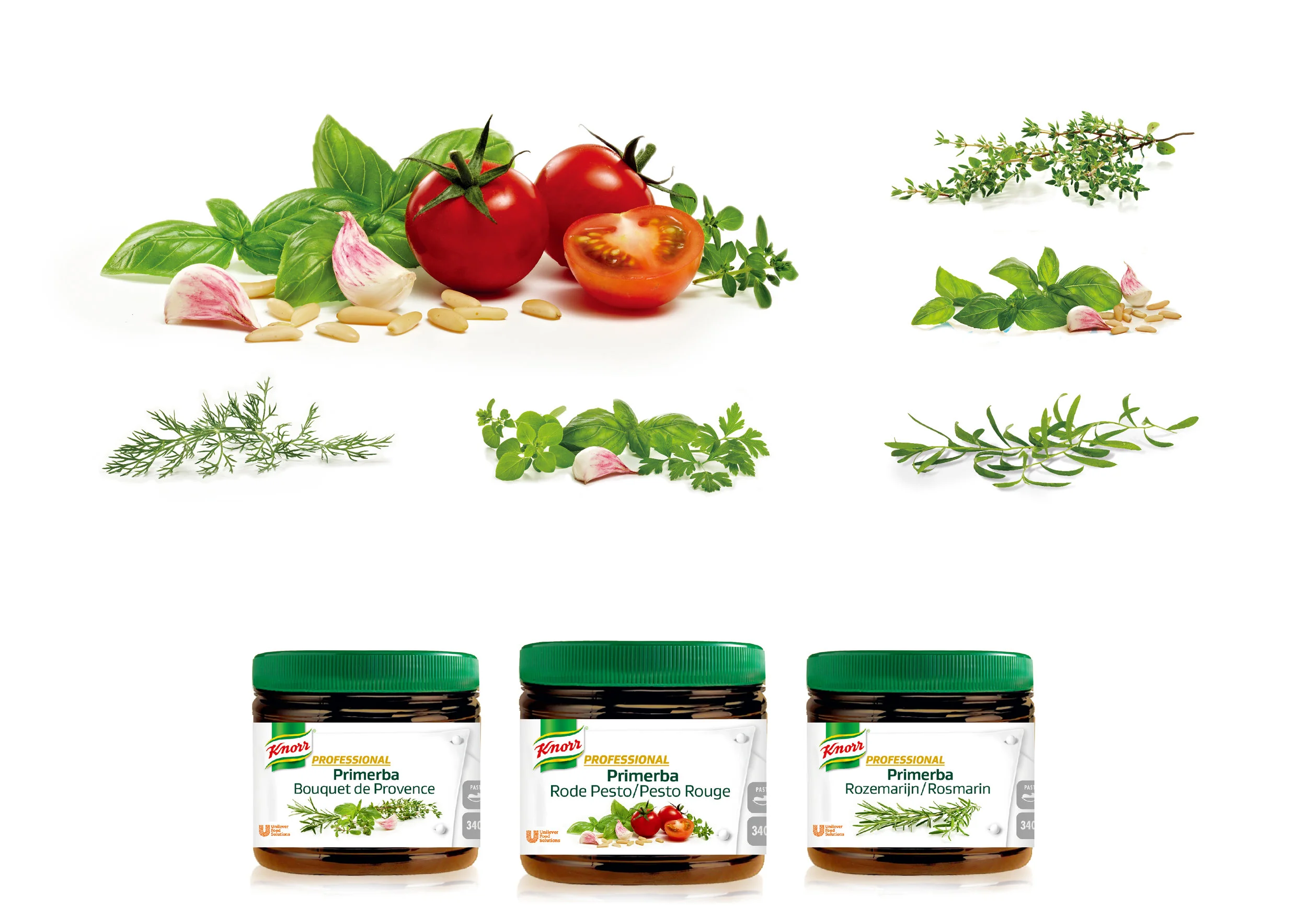
• Imagery style & photo shoot
• Guideline development
• Supervision of implementation agencies
Background
The UFS KNORR portfolio consists of three pillars:
• ESSENTIAL - An extensive range of standard savory products with widespread applications that help operators cook more efficiently.
• CONTEMPORARY - A wide range of savory products with natural attributes that enable chefs to create menu variations.
• PROFESSIONAL - The expert range for skilled chefs. Expert ingredients of the highest culinary standards mirroring each chef's philosophy.
Each of them is covered by a comprehensive guideline.
All ranges have to be adjusted to the new KNORR brand key, which includes over 3000 SKUs.The PROFESSIONAL segment is about:
• Focus on the key needs for chefs to have 'pride in cooking'.
• Key ingredient components (bases, binders, seasonings) to help skilled chefs in their cooking.
• Professional ingredients that housewives would not know how to use.
Challenge
We were looking for a global design solution while food is a mostly a local thing, therefor the design had to be able to reflect the different regions.
We faced the following questions:
• How can we heighten the PROFESSIONAL codes on our packs for immediate appreciation by skilled/executive chefs ('a space of recognition').
• How can we improve the information and navigation on pack for a wider product range.
• How can we find a global solution working also in Asia.
Solution
Skilled Chefs should select Knorr Professional when purchasing expert savory ingredients, valuing the brand’s highest culinary standard and its perfect integration into their cooking and creative process. This range should become the preferred choice for skilled Chefs of medium to upper level commercial. At the same time we wanted to establish a strong emotional bond with the target group.
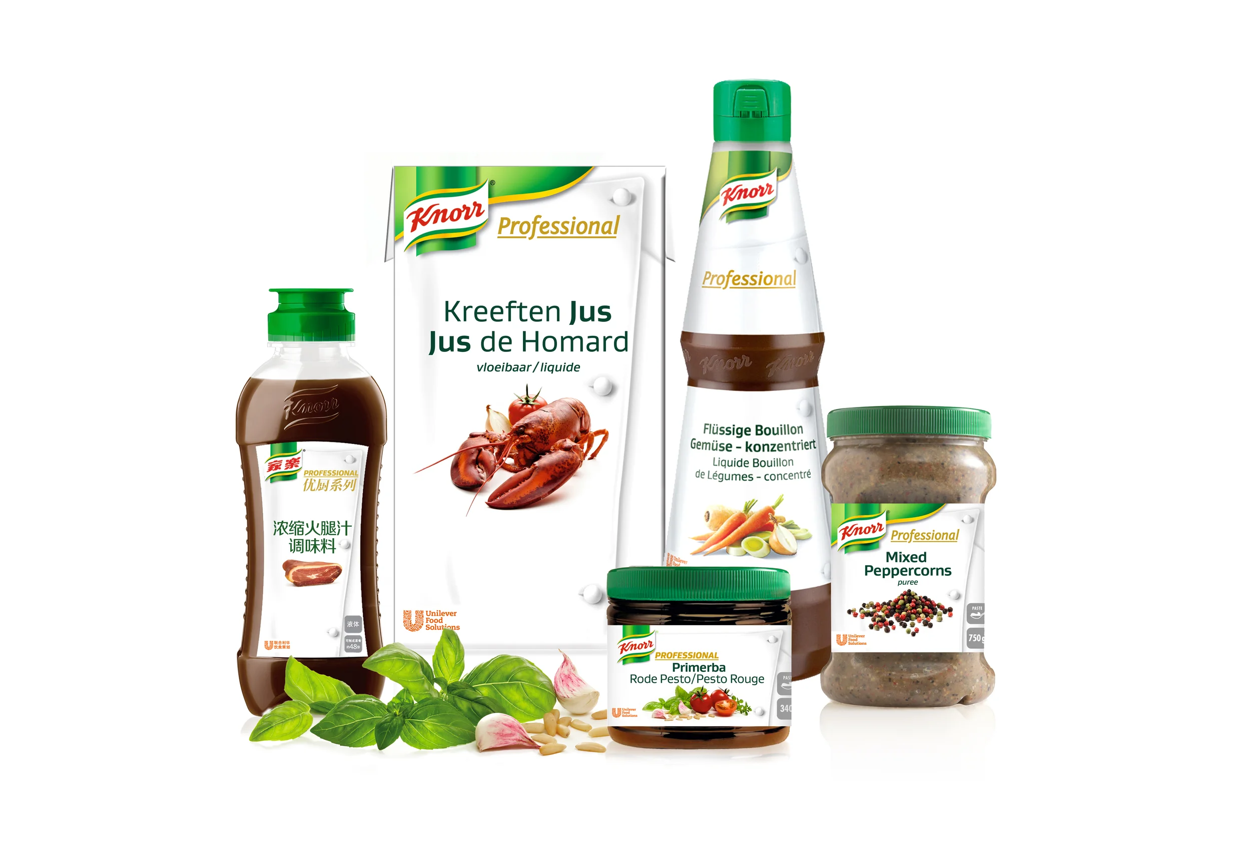
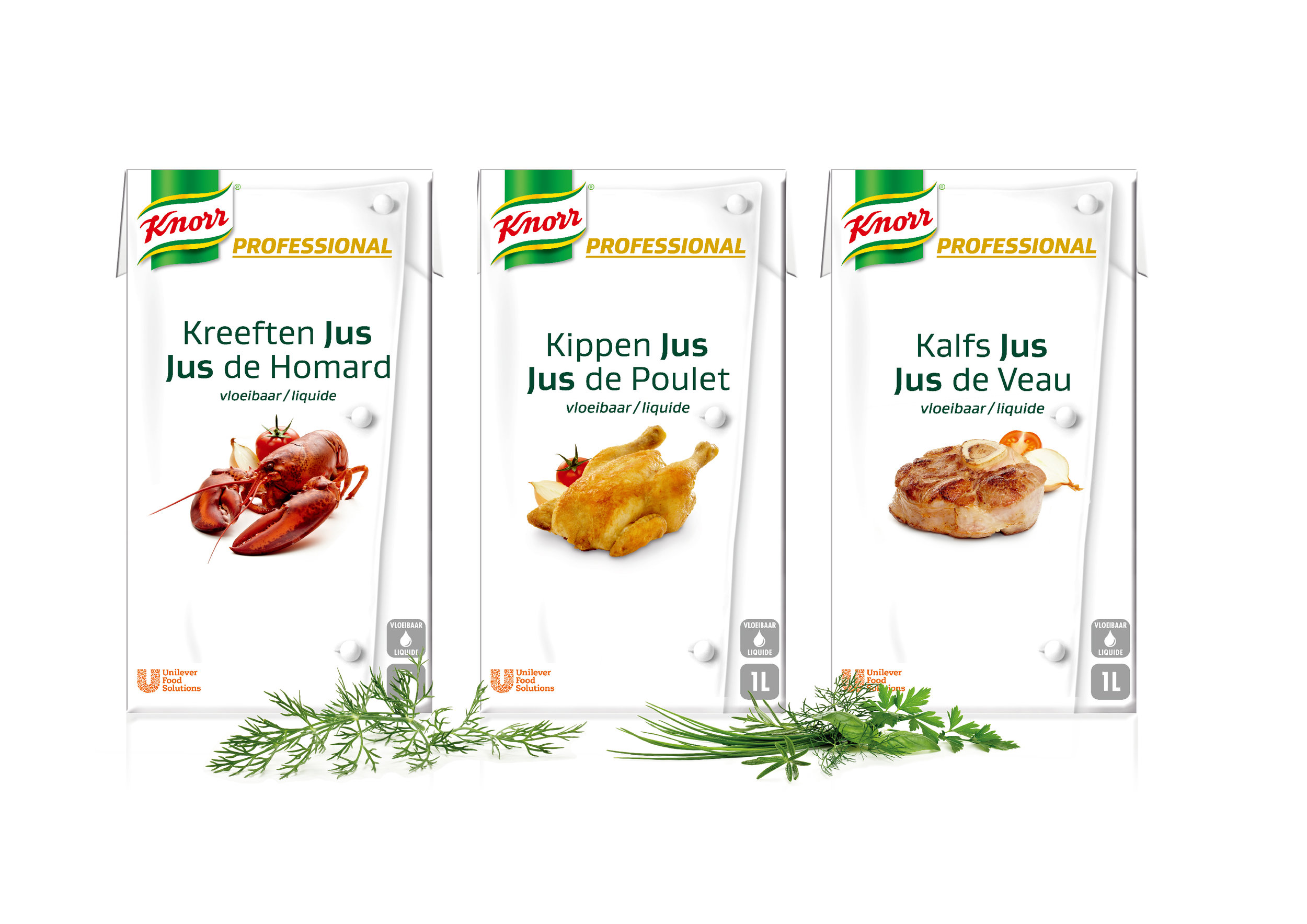
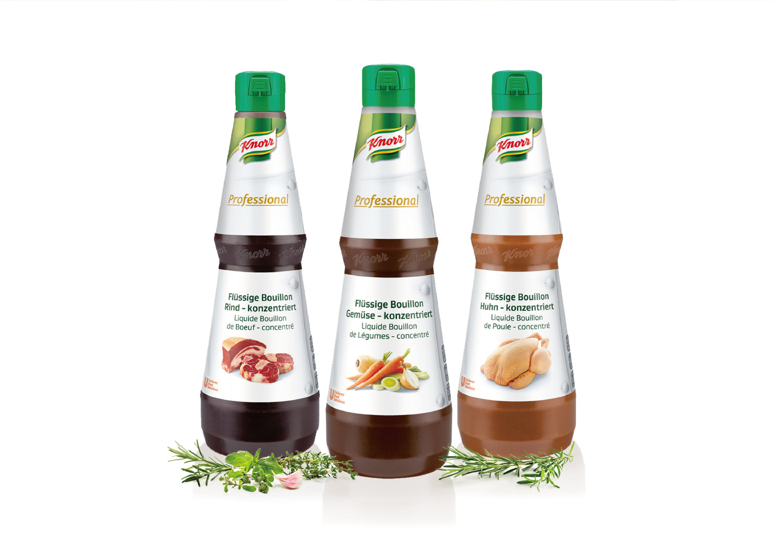
The white chef jacket functions as a strong, universal icon for the excellence of the skilled Chefs as well as the idea of being part of a passionate and dedicated team. The white, clean look has a professional feel to it and in combination with the high quality photos of the ingredient it stands for the high level of skills of the target group.
*Project during my time at INTERBRAND

