Responsibilities
• Packaging design
• Information hierarchy on pack
• Preparation & art direction for photo shoot
• Master design template
• Artwork creation
Background
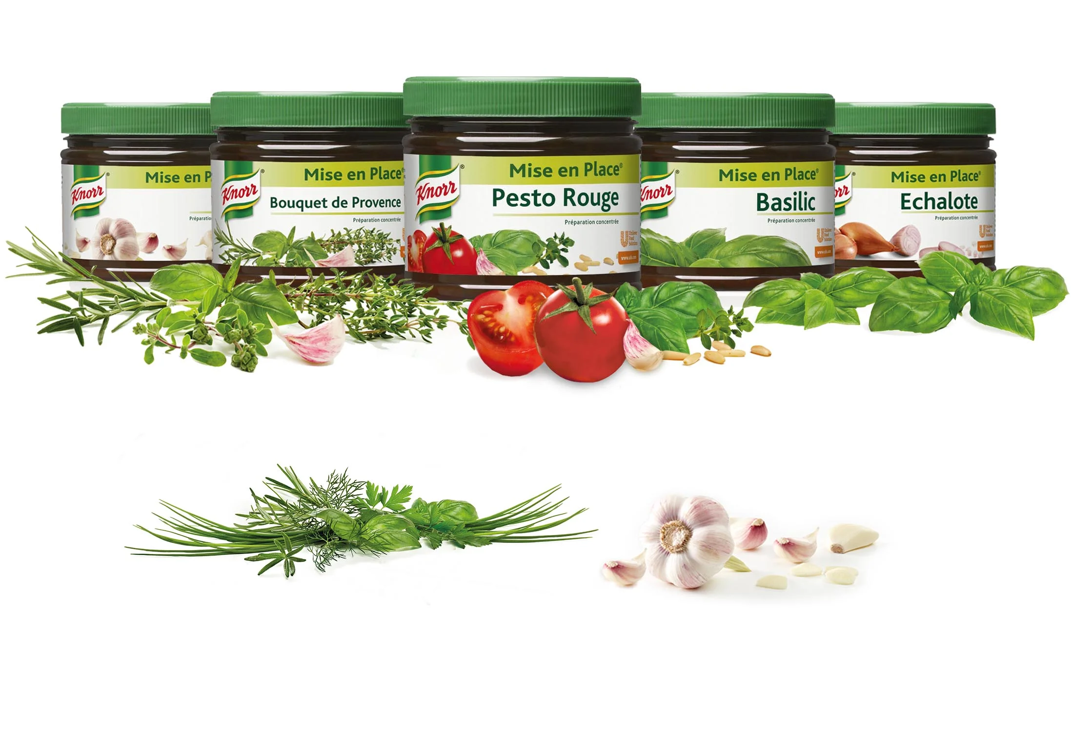
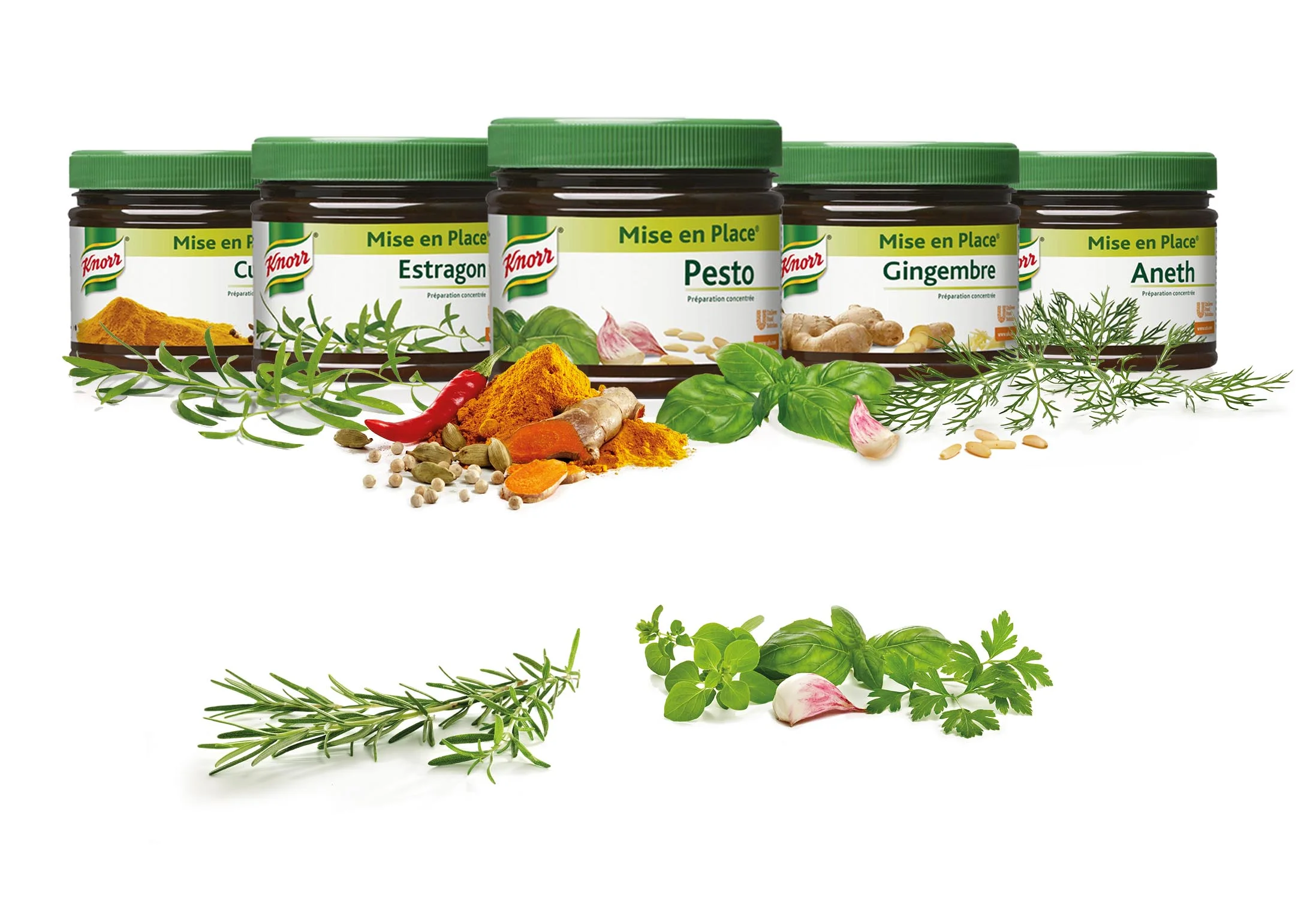
Under the Primerba range 21 products are being offered globally. Primerba is a premium range of herb pastes that is sold in 400 and 800ml jars. It is targeted to mainstream HoRE chefs who want a better proposition than dry herbs and it is currently the market leader.
It is sold under Mise en place in France and Switzerland.
Challenge
Over the last few years, competitors have entered the market with me-too's breaking Primerba's monopoly.
This design project aimed at modernizing Pimerba in line with the newly developed guidelines for Iconic and at strengthening it's market position. It's core proposition "Intensity" should be communicated on pack. The design should aid to gain back customers from me-toos and the dehydrated herbs category as well as gain new customers.
Solution
The new design conveys these values:
• Intensity of taste
• Premium quality
• Accessibility
Primerba keeps its iconic visual equities (the colour green, prominence of the name Primerba and typography). It has a strong shelf impact and differentiate clearly from the competition. The high quality herb imagery communicates the superb taste of Primerba.
*Project during my time at INTERBRAND


